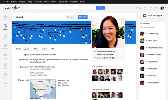
Google has started rolling out a fresh new redesign of its Google+ social network ,with enhancements like better navigation and larger photos, the company announced in a blog post today.
[aditude-amp id="flyingcarpet" targeting='{"env":"staging","page_type":"article","post_id":414932,"post_type":"story","post_chan":"none","tags":null,"ai":false,"category":"none","all_categories":"social,","session":"B"}']“We’ve just begun the worldwide rollout of a more functional and flexible version of Google+,” wrote Google Senior VP Vic Gundotra on his Google+ page. “We think you’ll find it easier to use and nicer to look at, but most importantly, it accelerates our efforts to create a simpler, more beautiful Google.”
Google has bet the entire company on social, for better or worse — with Google+ tying in to other services like YouTube and Docs. In a recent company update, CEO Larry Page said Google+ had more than 100 million active users, a sign the strategy is working. Of course, one caveat is how the company defines “active.” If a person accidentally finds themselves on Google+ once a month (which is easy to do), is he or she an active user?
AI Weekly
The must-read newsletter for AI and Big Data industry written by Khari Johnson, Kyle Wiggers, and Seth Colaner.
Included with VentureBeat Insider and VentureBeat VIP memberships.
Tough questions aside, the redesign appears to give those who use Google+ on purpose some handy new features and better visuals. First off, you’ll notice on the left side that there is a new customizable navigation bar that lets you drag apps up or down to create the best order for accessing content. You can even hide apps by moving them in and out of the “More” panel.
Next up, the redesign gives users bigger photos and videos so you can see content in more detail without putting in “lightbox” mode. Also new to the stream is an “activity drawer” that highlights the members of the community you might like and topics that are “trending,” like on Twitter.
For those that use Google+ mostly for the awesome Hangouts video chat feature, there’s news for you too. Google has now added a dedicated Hangouts page that shows Hangouts that are happening in your circles. You also get easy access to public hangouts, if you ever feel like being that creepy guy who drops in on someone else’s conversation.
Finally, there’s a new Explore page that you can access from the left-hand navigation bar. This page will make it easier to find fresh content when your friends and connections aren’t putting it up. You know, for the days when it feels like ghost town.
The roll out appears to be moving slowly as many folks on Google+, including myself, are still waiting for the redesign to go live. Google expects all users to get the new digs in “the next few days.”
Watch the promo video for the redesigned Google+ below:
[aditude-amp id="medium1" targeting='{"env":"staging","page_type":"article","post_id":414932,"post_type":"story","post_chan":"none","tags":null,"ai":false,"category":"none","all_categories":"social,","session":"B"}']
And here’s a video for the new navigation ribbon:
VentureBeat's mission is to be a digital town square for technical decision-makers to gain knowledge about transformative enterprise technology and transact. Learn More
