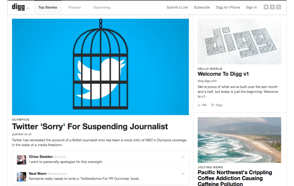
Iconic social news sharing site Digg launched a completely revamped version of the service today, one day ahead of schedule.
[aditude-amp id="flyingcarpet" targeting='{"env":"staging","page_type":"article","post_id":500843,"post_type":"story","post_chan":"none","tags":null,"ai":false,"category":"none","all_categories":"social,","session":"B"}']Previously, Digg was focused almost entirely on allowing users to vote on community submitted URLs, with the best stuff rising to the top for increased presence and generating massive traffic for the site that hosted the content. It got to about four versions under its previous owners, who attempted to change Digg in an effort to boost monetization. Changes in the old Digg v.4 made the site a convoluted mess of activity, which slowly drove away the bulk of its active users after launching almost two years ago.
By contrast, it took Digg’s new owners about six weeks to completely re-imagine the site as well as formulate a plan to restore Digg to its former glory. It was completely rebuilt from scratch, which is why the team is calling this the new version 1.
AI Weekly
The must-read newsletter for AI and Big Data industry written by Khari Johnson, Kyle Wiggers, and Seth Colaner.
Included with VentureBeat Insider and VentureBeat VIP memberships.
“The old Digg infrastructure was expensive and it afforded us little latitude to innovate and build at a fast clip,” the team wrote in a new frequently asked questions page. “We are starting with a fresh code base — it’s modern, it’s fast, and it’s shiny and new.”
And while I haven’t spent much time playing around with it, the new Digg is already more inviting than the one I saw over the past two years.
Just as yesterday’s relaunch preview described, the new Digg is much cleaner and quicker than the previous version. Familiar visual elements, like “digger” icons and 8-bit shovels, are gone. The abundance of Blue, Yellow, and Green have been replaced with lots of white space. But the biggest difference is undoubtedly the absence of submitted stories listed vertically along with a prominent box displaying the number of Digg votes next to headlines.
The new Digg also does something unlike most social news sharing services that have a centralized front page: it lets the content speak for itself.
Much like the wire frames indicated in the Digg preview, the site displays more important stories as larger, along with that story’s image. If you’ve gone through the bulk of “Top Stories” on the front page, just below it is a list of “popular” submissions, which displays user names and activity data (Digg votes, social shares, etc.) in addition to the submission’s headline. Below that is the “upcoming” stream of real-time submissions.
Some of the things the new Digg team will be working on over the next few months include experimental commenting features, alternate front page story views, a better mobile experience, reading list for web visitors, and a new Digg API. The team is also working on a way to restore all the user data from previous versions of the site. (For now, the team has set up a page where old Digg users can sign up to get notifications about getting their data back.)
[aditude-amp id="medium1" targeting='{"env":"staging","page_type":"article","post_id":500843,"post_type":"story","post_chan":"none","tags":null,"ai":false,"category":"none","all_categories":"social,","session":"B"}']
I’m sure I’ll have more thoughts on the site once I’ve had a chance to play with it. For now, let us know what you think about the new Digg revamp in the comment section below.
VentureBeat's mission is to be a digital town square for technical decision-makers to gain knowledge about transformative enterprise technology and transact. Learn More

