An all-new, radically different StumbleUpon web experience arrives Tuesday to provide the service’s more than 25 million content seekers with reworked ways to explore videos, photos, news, and articles from across the web.
Ten-year-old StumbleUpon, having just released a new experience for iPhone and iPad, is in the midst of a design and user experience awakening. The company, under the direction of new vice president of product Cody Simms, is remaking all of its products to be more personal and playful.
The new StumbleUpon.com includes many of the same mobile features rolled out last week, including a modernized homepage, ways to stumble through trending content and friends’ activity, and StumbleDNA, or a color-coded identity module that highlights each member’s likes. The web application also introduces a feature called “Lists” for organizing likes into shareable collections.
“We feel that the act of Stumbling across the web is unique and different,” Simms told VentureBeat. “The purpose of the StumbleUpon website is to help you find great stuff as a jumping off point to Stumbling.”
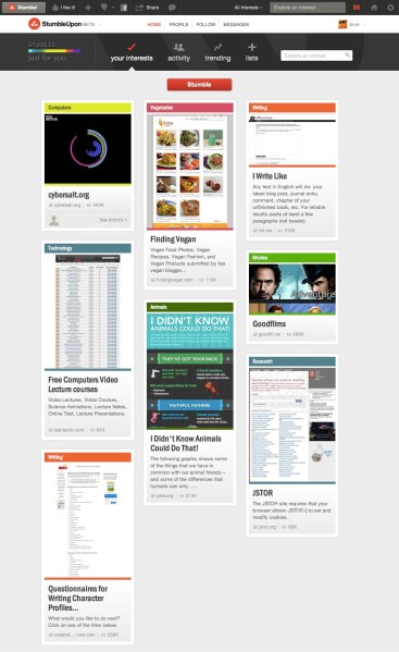
Most striking is the look and feel of the StumbleUpon homepage, which captures the essence of the iOS home screen but does so in a Pinterest-like fashion. Here stumblers are given three primary ways to thumb through the web’s treasure trove of content: via their interests, friends’ activity, or trending stories. The latter section showcases items generating the most amount of likes, shares, or community reactions.
Unlike on StumbleUpon for iOS, which employs an elegant, one-at-a-time “slide” approach for stumbling, the web stumbling experience starts with a hodgepodge of content pictured in rectangular boxes, à la Pinterest. The boxed style is apparent on each initial stumble page and provides the visitor with a smorgasbord of items, color-coded by interest, to select from.
“The layout, design, and navigation of the site in this iteration is built to optimize for quick scanning and quick access to content. We looked at a lot of different models and feel this design is the most effective model for content discovery,” said Simms in response to a question on why the company went with a design that echoes Pinterest’s popular style.
StumbleDNA, the color-coded bar that denotes a person’s tastes, gets more love on the web than it does on iPhone. The bar appears atop each page and is also now a prominent part of each member’s profile so that friends and followers can get a better sense of who the member is and what he or she likes.
The net effect of the redesign is that the first-time StumbleUpon visitor, returning lover, or long-time flame is given a never-ending stream of things to see, consume, like, or stash away for safe-keeping.
The new StumbleUpon.com is available to all members as a beta release. Members can opt-in to the refreshed experience from the settings section of the application. A version for Android is said to be development.
[vb_gallery id=538381]
VentureBeat's mission is to be a digital town square for technical decision-makers to gain knowledge about transformative enterprise technology and transact. Learn More

