Microsoft’s fledgling social network is a bit of a puzzler. Pronounced “social,” Socl debuted to the public Tuesday with a fresh coat of paint, new features, and no clear purpose.
The product of Microsoft’s Fuse Labs research team, Socl was originally intended to appeal to educational communities — design students, for instance — and folks who are want to collaborate online in unconventional ways. A year into testing, Microsoft has invited newcomers to try out Socl and redesigned it to be more adept at helping people connect around shared interests.

Above: My post on Boo, created with images from Bing search results.
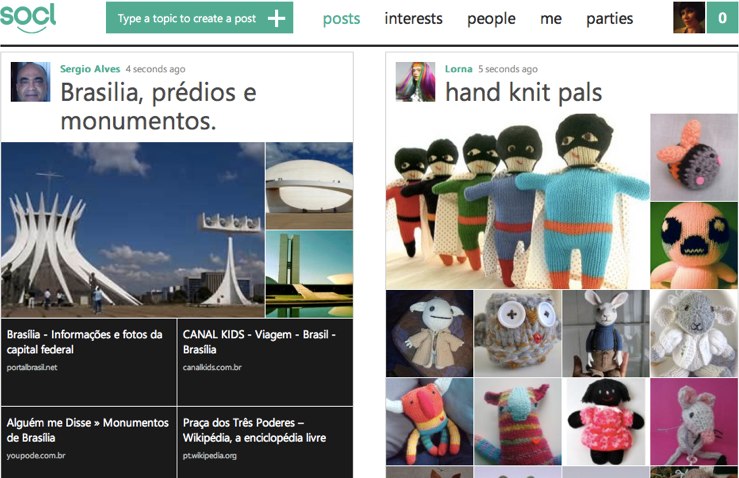
At its core, Socl is all about search, but search dressed up in pretty, image-rich collections. Posts take the shape of photo collages that members put together from Bing search results around terms or topics. Each image, video, or search listing in a collage links to the original web source. Members can comment, tag, like (technically “:)” at), and share posts to other social networks. People can also “riff” on posts, which is a feature that looks to be like a more open-ended version of Twitter’s retweet. You can be inspired by a cat collage and then go on to make your own, for instance.
“Socl helps people find and share interesting web pages by extending the search metaphor, create rich posts by assembling montages of visual web content and provides rich media sharing and real time sharing of videos,” a spokesperson said. “We encourage users to reimagine how everyday communication and learning tools can be improved by researching, learning, and sharing in their everyday lives.”
As far as I can tell, Socl users enjoy making posts that contain collections of their favorite things, be they puppies, animated .gifs from “Gangnam Sytle,” or random maps of Switzerland. Learning, not so much. Some also seem to want to use Socl as a more traditional social network, which means they’re posting individual photos and text updates to opine on the world at the large.
Spend a few minutes in the free-for-all “posts” stream and you’ll come across many a collage that seems to exist without rhyme or reason, likely because it’s a little confusing as to what you’re supposed to do here. The idea of collecting items around topics and interests is one that Pinterest has already made popular. The search results-only element both simplifies and complicates Socl’s collection-inspired collages. Finding exactly what you want to add is a bit of a pain because you’re forced to work with just what Bing serves up. The easiest option, then, is the most boring: adding the first several images or articles that Bing returns. The end result are collages that look a lot like search results pages.
Socl also comes with a feature called “parties” that lets people participate in online video viewing parties. Parties seem tacked on, and are a very loose stretch on the whole interest-based search experience. It’s as if Microsoft needed to create a semi unique foil for Google+ Hangouts and this is what they came up with.
The overall aesthetic is quite appealing, but Socl strikes me as more novel than useful. People do, as history instructs us, seem to get a kick out of novelty on the web. Plus, my post of Boo photos and links racked up a few instant reactions, so there seems to be a small but engaged audience ready and willing to help Microsoft sort out of the point of Socl.

