When President Barack Obama or Republican presidential nominee Mitt Romney tweet, millions listen. But how well do the candidates’ 140-character messages resonate with people across the nation? Now, we can turn to poli-sci tech from Twitter for the answers.
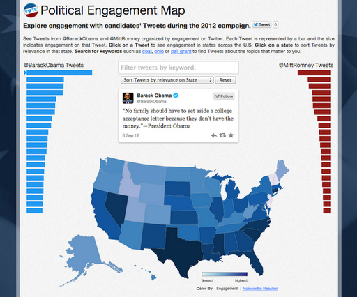
The information network today released a “Political Engagement Map” that visualizes engagement (replies, favorites, retweets, etc.) around each of the candidates’ tweets.
The interactive map ranks top tweets, illustrates tweet engagement by state, allows viewers to search by topics, helps people see the issues resonating most in a state, and highlights which states had higher than average reactions to individual tweets from either candidate.
“A great deal of media and campaign attention focuses on statewide polling, so we’ve been particularly interested in how users engage with political content on a statewide level,” Miguel Rios of Twitter’s analytics team wrote in a blog post Thursday.
The political engagement map, released just days ahead of Election Day, complements Twitter’s existing political index, which measures the mood of the nation by analyzing tweets mentioning Obama or Romney.

Photo credit: cobalt123/Flickr
VentureBeat's mission is to be a digital town square for technical decision-makers to gain knowledge about transformative enterprise technology and transact. Learn More
